|
|
Post by Moe on Jul 17, 2008 19:59:02 GMT -5
Well, the Amarantine cover was dissected and debated at other forums, so how about equal treatment for the cover of ADWR?
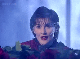
I think I am in the minority here: I am not fond of it. It's not that I wanted a more "fairy queen" type of cover, but the photo of Enya did not strike me as one of her best.
(puts head in paper bag)
|
|
|
|
Post by Treecat on Jul 17, 2008 21:37:22 GMT -5
Enya looks gaunt in the photo. The pose is awkward, and there's something 'painterly' about the image. I still like it though. I like pale green colors, I like the old chaise she's sitting on, and the feeling that she's sitting outdoors. It's a fresh, relaxed image that fits the music.
|
|
|
|
Post by draoicht on Jul 18, 2008 9:15:57 GMT -5
It is not one of my favourite pictures of Enya herself, she looks somewhat different in the picture. Like TreeCat I do like the backdrop for the cover. It is still better than the Amarantine cover though, I just do not like it at all.
|
|
|
|
Post by riene on Jul 18, 2008 10:28:00 GMT -5
The pose looks really uncomfortable, and I'm not fond of the hairstyle. I do like the casual appearance, the greens and violets color scheme. Eithne looks far too thin in the image.
|
|
|
|
Post by Moe on Jul 18, 2008 12:30:31 GMT -5
When I first saw the cover I actually thought she looked ill. And the hairstyle was also not to my taste, but then, mine looks like a hurricane just went through it.  I admit it's a nice, casual look overall, but elements in it do not take my fancy. As for the Amarantine cover, well, draoicht, I do not think you are alone in your view. I have no idea what the next cover will be like............... |
|
|
|
Post by Treecat on Jul 18, 2008 12:35:33 GMT -5
Here's an odd thing about the cover: the photo was taken inside (I believe an old house in Dublin IIRC), but it has a distinctly "outdoor" feel to it. Whenever I look at it, I have the impression that just out of view are strawberry jars filled with herbs, gravel paths that lead through a tangled English garden with bees flying about and the air filled with the sound of katydids.  |
|
|
|
Post by oregonwinebaby on Jul 18, 2008 14:48:07 GMT -5
I like the cover, but I agree with some of the things being said here. During the ADWR time, not just that cover shot, Eithne seemed to be just overall not happy or satisfied with something. She almost has that indifferent "sigh, whatever" look to her. Maybe even kind of a sad or despondent? I always felt that something major changed in her personal life during the making of that album. The Amarantine cover may not be everyone's favorite, but you can't deny she just looks happy. That is what I like so much about it.
|
|
|
|
Post by Moe on Jul 19, 2008 8:49:47 GMT -5
I like the cover, but I agree with some of the things being said here. During the ADWR time, not just that cover shot, Eithne seemed to be just overall not happy or satisfied with something. She almost has that indifferent "sigh, whatever" look to her. Maybe even kind of a sad or despondent? I always felt that something major changed in her personal life during the making of that album. The Amarantine cover may not be everyone's favorite, but you can't deny she just looks happy. That is what I like so much about it. I think you've hit the proverbial nail on the head: she does look "indifferent" - even "distant" - as if she'd rather be doing something other than posing for a cover photo. She did seem like a much more relaxed, happier person as she promoted Amarantine. So perhaps life did change in some way, somewhere between ADWR and Amarantine...... and for the better.  |
|
|
|
Post by Treecat on Jul 19, 2008 9:10:12 GMT -5
oooooh!! Different viewpoint! I feel the opposite about the cover. ;D |
|
|
|
Post by skyscape on Jul 21, 2008 6:07:22 GMT -5
I didn't like the cover at first but I've grown to love it; the pale greens are wonderful and I love that it looks like a piece of classical art.
I actually hate the Am cover....yes, hate.
|
|
|
|
Post by riene on Jul 21, 2008 11:29:31 GMT -5
I have to say that I like the ADWR cover better than any of the "Celtic Fairy" covers, because she looks human in this one. I truly dislike the waaaaay too Photoshop-processed image on Watermark. She just looks grim in that photo.
The Amrantine cover is ok. I don't like the colors in it, but it is eye-catching and dramatic, and Herself looks good in red. I look at that and wonder how her knees felt once they finally let her stand up.
The images I would rather never see again are the gold single cover where she's lying down (Enya shouldn't "do" sexy), and that black and white profile image with the Che Gueverra hat. Ugggggh.
|
|
|
|
Post by marie on Jul 21, 2008 13:17:01 GMT -5
I like the cover but Eithne does look sort of ill and frail. Maybe she wasn't feeling her best.
|
|
|
|
Post by skyscape on Jul 21, 2008 13:20:37 GMT -5
I think one of the most successful covers was that for SM. It was a very well-produced package of music and artwork.
I know the Amarantine cover debate has been done to death, but it really is quite shockingly bad IMO, and years of looking at it have not lessened my dislike for it.
There is a quite stunningly simple yet beautiful promo shot taken for the Amarantine portfolio, which shows Enya's face very straight on and would have been a wonderful album cover.
|
|
(C)arl
Member
 If you're not confused, you're not paying attention.
Posts: 202
|
Post by (C)arl on Jul 21, 2008 13:32:16 GMT -5
I like the cover of ADW. I only have to agree that her pose looks rather odd, and her hair looks as if she just came out of the shower. But I like the setting very much.
|
|
|
|
Post by Moe on Jul 21, 2008 15:15:48 GMT -5
I didn't like the cover at first but I've grown to love it; the pale greens are wonderful and I love that it looks like a piece of classical art. I actually hate the Am cover....yes, hate. I've opened a thread in "Amarantine" for discussion of this cover. I know some folks didn't like it at all: was it the simplicity, the pose, the leggings? What bugs people about this cover? Please post about it over there, eh? As for ADWR: I too liked the SM artwork/photos - in fact I have a SM poster in my basement. But, as much as I still like it, I feel Enya has moved on, away from that particular image. I would be very surprised if the next album went back to the SM style. That said, ADWR just did not, in my view, show Enya as the beautiful woman she is. When I look at the Enya photos in OT:TC, I see a mature, stunning Enya, not the rather frail person I see on ADWR. I guess it's that dichotomy that puzzles me. The two "blocks" of photos are not that far apart in time. |
|


 but nighttime tends to be more special, filled with 'oceans, clouds and stars'.
  🌊🌫️🌌
🌊🌫️🌌