|
|
Post by Treecat on Jul 25, 2008 8:04:25 GMT -5
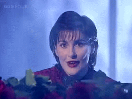
Another 100% crop taken from further back on the skirt. This is on the back cover of the booklet and is near the end of the train:  |
|
|
|
Post by skyscape on Jul 25, 2008 9:10:36 GMT -5
Wow TC what a lot of work! I'm not sure whether the garment is in two sections now or not, but it looks that way....what do you think yourself?
|
|
|
|
Post by Treecat on Jul 25, 2008 9:14:21 GMT -5
Sky, I think it's the same material throughout. The file is 5 meg in size, so it's impossible to post it here. I can't see any joins or lines that indicate that two different kinds of material were used.
|
|
|
|
Post by Moe on Jul 25, 2008 11:37:28 GMT -5
Thanks for your analysis, TC. That must have eaten up a bit of time  |
|
|
|
Post by ardens on Jul 25, 2008 14:23:13 GMT -5
The "Amarantine"-cover isn't my favourite one, but it's ok. The combination of black, red and white is often used for CD-covers and book-covers, maybe because it's eye-catching.
In my opinion, the cover reflects the style of some of the songs well. It hasn't a lot in common with my image of the Loxians, but it fits songs like "Amarantine" or "A moment lost".
|
|
|
|
Post by astro on Jul 26, 2008 19:55:47 GMT -5
Talk about in-depth!
Well, I'll toss in my two cents... I'm of the opinion that this cover work was what it is for several different reasons.
1. A tribute to Tony McAuliffe and...
2. Giving the younger bunch at Aigle a shot at it.
Kinda an in-house effort with a lot of heart. Now, this stuff about fudging the snapshots to smooth out whatever should be something obvious to everyone. How old is the Artist now?
With that said, I want to get on the Soapbox a bit here. I'm old school in a decent sense. Some of you may know how devout I am spiritually, some of you may not, so I'm approaching this from the standpoint of Son, Brother, Husband, and Father.
Women get treated like dirt by the more callous. Unfortunately, as in other affairs, sex sells. There are several options to overcome "discrepiences" by the use of plastic surgery, injections, make-up, etc. I suppose the least evasive of all options would be photoshopping. If the latter was employed then I say so be it. From my viewpoint I wouldn't think it prudent to go under the knife, needle, or trowel but I suppose it is a matter of vanity, especially with the business she is in. Personally, I prefer Enya natural, but how many would turn away from her if she did that? Wouldn't see to many tweens and teens swinging the label of "Fan" about I imagine.
Stepping down from the Soapbox now... NEXT!!!
|
|
|
|
Post by Treecat on Jul 28, 2008 8:28:03 GMT -5
Sky, Kerry -- it really didn't take long to scan the cover and crop out a few sections of the jacket & train and post them. I've been meaning to do this since the cover discussion first started when the album was released. I'm glad you provided the push I needed to actually do it.
On consideration of the jacket & train, it's possible that much of the train was created by cloning areas of the jacket and 'painting' the train, adding in the highlights. Perhaps the real outfit was a long jacket with tails similar to what she wore for Anywhere Is, worn over tights?
The more I look at it, the more artificial the train looks, and it's this artificiality that bugs me.
What about this as a cover: one of the promo shots taken at Kilruddery, particularly the one where she's sitting on the violet/purple chaise with the deep shadows around her. Print the words "Amarantine" and "Enya" in gold and place them in the upper left hand area of the sleeve. Would that have been better?
|
|
|
|
Post by Treecat on Jul 28, 2008 8:46:49 GMT -5
Astro, I don't think photoshopping Enya's photos is so much an age/sex thing as it is that she seems to prefer photos that have an artwork quality to them. Even the Watermark cover is 'arted' up with the film cell painting. The other photos used on the booklet/LP of her wading in the sea and standing on the shore are very impressionistic--grainy, out of focus, atmospheric.
The photo enhancement continues with SM, and goes full-force with TMOT. So many of the publicity photos for TMOT are photo-shopped in some way--color saturation increased on the cover photo, the extreme highlights on her face in one of the sleeve photos. The cover of ADWR almost looks like a painting to me. The photos in the OT-TC booklet are very art-styled.
Amarantine just blows the photo-shopping out of the water. It's as if all the photos for this album were done to create a very romantic mood. It's just a given that in working on publicity and cover photos, they're going to: smooth the skin, if needed, airbrush creases around the eyes, but mainly, I think they're creating a mood.
|
|
|
|
Post by Moe on Jul 28, 2008 9:00:35 GMT -5
This is where I have a problem with the Am cover: it does not conjure up a clear mood for me (yes, I am eccentric, I know). Is it sexy? Ready to pounce like a tigress? I don't see "sad" or "love lost" etc. It may well seem romantic to others, but not to me.
OTOH, my husband loves it!
|
|
|
|
Post by Treecat on Jul 28, 2008 9:15:09 GMT -5
This is where I have a problem with the Am cover: it does not conjure up a clear mood for me (yes, I am eccentric, I know). Is it sexy? Ready to pounce like a tigress? I don't see "sad" or "love lost" etc. It may well seem romantic to others, but not to me. OTOH, my husband loves it! The cover photo is a lot different from the lush, romantic publicity photos that were taken for the art cards. Maybe Riene's on the right track: they were looking for a simple, striking cover that would stand out on the shelves. I wonder what the background of that photo was? Would it have made more sense if Enya had been left in the context of the background--perhaps some massive manor house hallway ala the OT-TC shots? |
|
|
|
Post by Becket on Jul 29, 2008 14:46:14 GMT -5
I always thought there was room for more creativity for the cover...something could have been added to the background...
|
|
|
|
Post by Treecat on Jul 30, 2008 8:33:21 GMT -5
I always thought there was room for more creativity for the cover...something could have been added to the background... It's too stark. There could have been a creative minimalist background that would have enhanced the image. Just pulling her image out and popping it onto a plain white wrapper--something seems missing. |
|
|
|
Post by skyscape on Jul 30, 2008 8:44:49 GMT -5
Wasn't there a lot of confusion prior to release as to whether this was the single cover or the album cover? I remember a lot of farting about with fonts etc and the wrong picture being put on the site.
|
|
|
|
Post by Treecat on Jul 30, 2008 8:57:44 GMT -5
Wasn't there a lot of confusion prior to release as to whether this was the single cover or the album cover? I remember a lot of farting about with fonts etc and the wrong picture being put on the site. At one time, it seemed like the gold single cover might have been selected as the album cover. I remember one image released (was it on the website) which used a different font--I think the same font as ADWR. I've also seen an image where Enya's photo is reversed, and she faces to the left instead of the right. Regarding the gold single and the album covers, I've wondered if Aigle/Warner were sending up trial balloons to see which cover was generally preferred for the album. Then they selected the red/white cover for the album and the gold cover for the single. |
|
|
|
Post by skyscape on Jul 30, 2008 10:22:44 GMT -5
The font originally on the red and white album cover was the Romantic font used on the Amarantine single. There was uproar when people saw that font on the album cover and thankfully the real album cover had the calligraphy style font in the end-up.
|
|


 but nighttime tends to be more special, filled with 'oceans, clouds and stars'.
  🌊🌫️🌌
🌊🌫️🌌