|
|
Post by Moe on Jul 21, 2008 15:13:17 GMT -5
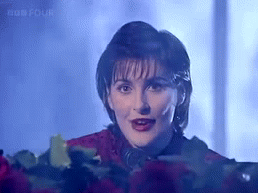
I can post this thread here because I know the discussion will be thoughtful and rational.  Love it, hate it, indifferent? How do you feel about the cover for Amarantine? |
|
(C)arl
Member
 If you're not confused, you're not paying attention.
Posts: 202
|
Post by (C)arl on Jul 21, 2008 15:26:22 GMT -5
Well, its different.  It't different than any other Enya cover. It't different than any other Enya cover.
It's as if she has evolved from a cottage house to a very modern house. I know it's a weird comparison, but I just mean that there was always much attention paid to the background of the cover, or the setting, as you would like to call it. With Amarantine its very simple, because there is no background. And I think that’s really unfortunate.
Apart from that, and I think I mentioned this before, the Amarantine cover has this Japanese feel to it, for me. I think because of Enya’s strait black hair and the red dress. I also believe that the Amarantine cover was inspired by Sumiregusa.
|
|
|
|
Post by oregonwinebaby on Jul 22, 2008 0:29:29 GMT -5
I don't mind this cover at all. I would have chosen a different pose however. Those black leggings (this was brought up in a different thread) are not...well...they are awful lol. That pose required them, in a way. I like the dress ok, and I think she looks beautiful and happy. The stark white background I have a love/hate relationship with. I sometimes see it as simple yet classy or elegant, and I sometimes see it as stark and empty. Overall, I give it a 3.5 stars out of 5. If ADWR had a happier/healthier looking Enya on the cover, I would give it 5 out of 5 as I love the colors and everything around her.
|
|
|
|
Post by skyscape on Jul 22, 2008 6:19:20 GMT -5
The Amarantine Cover - I posted quite a bit on this at Unity so I'll keep it short.
I know that people say "Don't judge a book by it's cover" but do they say the same for album covers?
A well-chosen album cover is a piece of art and should complement the music within. The Amarantine Cover is stark and stripped bare like much of the arrangements on the album but IMO the cover just does not work. I feel that a white background can work when the image on top is strong, but in this case the image looks pasted on. I don't care for the font and the pose in which Enya is kneeling looks snake-like and contrived.
Most of all I dislike that the red train has been photoshopped on and the red colour is different on the pasted-on section, and has been made to look like rubber or PVC. Why couldn't a custom-made silk train have been commissioned so that the entire garment was the same colour and material?
I think the concept of the album cover is good, but the exectution is untidy. My least favourite cover.
|
|
|
|
Post by riene on Jul 22, 2008 7:42:25 GMT -5
You can see that too, Sky? I posted about the Photoshopping of that cover on Unity when it came out, and basically got laughed at by everyone.
I can see a fine line between the dress and train, and when I blow the image up sufficiently, I can see where solid black (no variation at all in the tones) has been added over the tights. I think there are places on her neck, hands, face, and chest where some smoothing was done.
I don't think there's anything "wrong" with it...I just found it surprising.
|
|
|
|
Post by skyscape on Jul 22, 2008 8:16:45 GMT -5
You can see that too, Sky? I posted about the Photoshopping of that cover on Unity when it came out, and basically got laughed at by everyone.
I can see a fine line between the dress and train, and when I blow the image up sufficiently, I can see where solid black (no variation at all in the tones) has been added over the tights. I think there are places on her neck, hands, face, and chest where some smoothing was done.
I don't think there's anything "wrong" with it...I just found it surprising. Yes Riene I spotted that also, and don't you think that extensions have been added to Enya's hair? Also some of the length that can be seen on the Am cover has been removed on the Special Christmas Edition cover, which is a slight improvement on the Am cover. |
|
|
|
Post by Moe on Jul 22, 2008 9:32:55 GMT -5
On the plus side:
When the CD came out and arrived in stores, the cover did stand out; I could find it easily, without having to ask someone "where is the new Enya CD?"
Be that as it may, the all white, empty background just did not appeal to me as a photographer.
|
|
|
|
Post by skyscape on Jul 22, 2008 11:18:00 GMT -5
It could be argued that the cover is an indirect homage to the Japanese flag - the red on the white background.
This, plus the appearance of a track in Japanese and the calligraphy and Japanese-style artwork of the sleeve all seem to be Enya's most obvious nod to her love of the East (albeit subtly expressed in the artwork).
|
|
|
|
Post by oregonwinebaby on Jul 22, 2008 13:55:15 GMT -5
It could be argued that the cover is an indirect homage to the Japanese flag - the red on the white background. This, plus the appearance of a track in Japanese and the calligraphy and Japanese-style artwork of the sleeve all seem to be Enya's most obvious nod to her love of the East (albeit subtly expressed in the artwork). I never thought of it this way...nice point! You know, I feel a bit silly. I have never really looked deep into the cover for photoshopping flaws and such. I am glad I haven't otherwise I might end up not enjoying it. However, I have a 12x12 print in a frame that I might be inspecting later. I'll try to resist. As for the cover being "untidy" I can say that too. Everything that everyone has pointed out as flaws is exactly what one gets when they don't employ a true professional. In a way, it's kind of "cute" that they do their own work ;D |
|
|
|
Post by Treecat on Jul 22, 2008 18:09:54 GMT -5
Aggggh! I've read all the Amarantine photoshopping threads at Unity, Pmed several of you about them, looked at the cover myself, and I still can see the things you're talking about. Clearly I need to get bigger image files of the cover, or scan it myself and pull it into Photoshop.
I have something to do this weekend! ;D
|
|
|
|
Post by skyscape on Jul 25, 2008 7:17:46 GMT -5
Aggggh! I've read all the Amarantine photoshopping threads at Unity, Pmed several of you about them, looked at the cover myself, and I still can see the things you're talking about. Clearly I need to get bigger image files of the cover, or scan it myself and pull it into Photoshop. I have something to do this weekend! ;D Try this TC. Open out the CD case flat on a table so that you can the full picture. Notice the difference in texture between the red cardigan type garment that Enya wears on the front cover and compare it to the rubber-texture and the odd way the garment ripples on the back. |
|
|
|
Post by riene on Jul 25, 2008 7:24:56 GMT -5
The bodice and sleeves of the dress looks like velvet or velveteen to me, and the train/skirts looks more like satin. Matte vs shiny, in other words, which is what first made me look at it. It seemed an odd way to construct a dress, but that's just me being female.
|
|
|
|
Post by Treecat on Jul 25, 2008 7:29:42 GMT -5
I'll do that, Sky. But it's odd. If it's the way you and Riene say it is, why didn't they design a costume will a long, full skirt in the first place, so that the material would be consistent? It's not like she's Susie Strawberry releasing her first album on a K-Mart budget. She can afford to get the dressmaker to trot out a real dress the way it's supposed to be.
Unless--who designed the cover, and was the concept developed from the beginning, prior to the photo shoot. If it wasn't, then the photoshopping might have been done to accommodate the final design, which called for a long skirt. But even with photo-shopping, why is the material so different? I'll have to look and see for myself.
I am now looking. I'd forgotten the highlights on the train of the skirt. I wonder if that's just the velvet material being affected by lighting, and artificial highlighting via Photoshop? Gee, I haven't finished my first cuppa yet. Am I into putting this into the scanner right now?
What do you think--300 dpi or 600 dpi?
|
|
|
|
Post by Treecat on Jul 25, 2008 7:44:25 GMT -5
Done. Scanned at 600 dpi. I used the descreening mode on the scanner to remove the moire that comes with printed materials.
My opinion:
It's the same velvet fabric throughout, with highlights causing a difference in the appearance. At full-size I can see the same pattern of the fabric throughout.
Errr.. the jpg is 4.86 meg in size. I could crop samples from the train and body areas and post those, but I don't anyone wants to sit through the loading of a file this size.
|
|
|
|
Post by Treecat on Jul 25, 2008 7:57:14 GMT -5
Okay, here are two 100% scans of the dress & skirt: A scan taken from the shoulder area:  A scan taken of the skirt, including some highlight and non-highlight area:  A scan of the skirt taken further back, near the fold of the CD booklet:  BTW, when the launch photos were put on .com showing Enya in the backless dress, there were jokes about pixel-peeping Enya and getting arrested for it. If I'm arrested, I fully expect my MH friends to go my bail for me! ;D |
|


 It't different than any other Enya cover.


 but nighttime tends to be more special, filled with 'oceans, clouds and stars'.
  🌊🌫️🌌
🌊🌫️🌌