|
|
Post by riene on Sept 20, 2009 8:57:23 GMT -5
|
|
|
|
Post by eternity on Sept 20, 2009 12:33:24 GMT -5
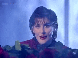
I expected some new photo, not an old one photoshoped. I always loved that photo, and understood the "flower effect" they intended, but a real new photo will be always better. Just my opinion.
|
|
|
|
Post by phantas on Sept 20, 2009 13:54:29 GMT -5
I like it...I love flowers and photos of them, and to finally HAVE an Enya picture with a Flower is something of a secret idea of mine....
I love the way they've done it too, very striking and still elegantly Enya.
I had no idea whatsoever on what kind of picture this best of could have, and I'm afraid I would have liked any kind of picture as long as it wasn't a generic one - I'm glad the Enya team have taken the time to come up with something good.
Love,
Phantas
|
|
|
|
Post by oregonwinebaby on Sept 20, 2009 16:02:27 GMT -5
I voted option #4 for a few reasons. First, I don't hate the picture by any means. I really do appreciate the time and thought they put into it, I really do. It is very creative.
Having said that...
1. Enya hugging herself. Although I personally don't mind it, It's been kind of a long running "theme" (I hate to say, joke?) with fans and NON fans. It's the non fans I worry about. They rib her for it quite a bit - and I think it keeps a false impression of what/who Enya really is. That can negatively impact the music.
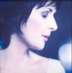
2. I prefer newer pictures of Eithne. It's just a personal opinion. She's beautiful at any age, but her look now is so matured and refined. I see so much more when I see her newest pics vs her older pics.
3. Photo shopping. No reason to ever photo shop a picture of Enya. Ok sure, you sort of have to somewhat if you are going to insert an older picture of Enya to a newer background...but I'll go back to #2. I don't know...I just don't like any option that requires it. I would have liked it better if they put Eithne today in a photo shoot with an older, but revised, backdrop.
|
|
|
|
Post by Becket on Sept 20, 2009 20:31:16 GMT -5
I like it, I would think that there would have been a bit more creativity to it...but you know, Enya has become the centerpiece...I really would have liked to have seen Enya in a famous painter's picture dressed up...like a Monet...I really like TMOT, Watermark, and Sheperd Moons covers because those covers and pictures just seem to reflect the creativity of Enya and the music as well as herself...she really is an artist...
You know Enya standing as an artist with canvas, paints, brushes, painting musical notes would have been great...something... ;D
|
|
|
|
Post by oregonwinebaby on Sept 20, 2009 20:57:52 GMT -5
I like it, I would think that there would have been a bit more creativity to it...but you know, Enya has become the centerpiece...I really would have liked to have seen Enya in a famous painter's picture dressed up...like a Monet...I really like TMOT, Watermark, and Sheperd Moons covers because those covers and pictures just seem to reflect the creativity of Enya and the music as well as herself...she really is an artist... You know Enya standing as an artist with canvas, paints, brushes, painting musical notes would have been great...something... ;D Oooh! Maybe Enya standing in a row of her paintings...each painting, from left to right, are her main albums. Maybe have a few Loxian scripts painted somewhere in the background... |
|
|
|
Post by Treecat on Sept 21, 2009 9:28:36 GMT -5
I like it, I would think that there would have been a bit more creativity to it...but you know, Enya has become the centerpiece...I really would have liked to have seen Enya in a famous painter's picture dressed up...like a Monet...I really like TMOT, Watermark, and Sheperd Moons covers because those covers and pictures just seem to reflect the creativity of Enya and the music as well as herself...she really is an artist... You know Enya standing as an artist with canvas, paints, brushes, painting musical notes would have been great...something... ;D That's a great idea. I like it! I like the simplicity of the design, but I was also hoping they would use the MMTF promo cover. I probably got my expectations too high that they would use it. I'm waiting to see what the real thing looks like, and what the insert and liner notes might be like. |
|
|
|
Post by phantas on Sept 21, 2009 11:08:12 GMT -5
now that I've had some time to mull it over - some good points made here  - I feel that personally I would have probably used a different, if not a new photo of Enya, but in the light of the fact that it is a "best of" I can see why they chose this picture. Unfortunately, it's not one that I feel is a favourite of mine, as I've seen it in various formats/colours a bit too many times. That said, I still think it is a nice cover for what seems to be a simple collection of Enya's finest. I do not believe there will be new tracks (I'm hoping there will be) but I'm still quite curious as to the content of the special edition DVD. Can't we hold a little competition of our own to see who of us can create a better/different cover? LOL! Love, Phantas |
|
|
|
Post by Becket on Sept 21, 2009 11:43:42 GMT -5
I wish they would have asked for our ideas on a CD cover instead of that banner for the Loxian games...That is a great idea Phantas...well the admin would have to bless such a contest...What would the prize be? HMMMMM...
|
|
|
|
Post by riene on Sept 22, 2009 17:49:48 GMT -5
It's bright and will stand out well on the shelves, and tbh, a younger Enya may well be more appealing to people new to her music. That said, I would have liked to see the MMTF single cover (and it's a perfect song choice as well) or a new photo chosen for the cover.
I liked this photo when it came out--the darkness and mystery, the lace dress--but I don't much care for the addition of the parachute skirt. Had I never known of the original, maybe it wouldn't have been such a surprise.
|
|
|
|
Post by Treecat on Sept 23, 2009 9:53:13 GMT -5
I like the ADWR and TMOT covers, and the WM cover. I adore the pound puppies on ENYA. But, you know, I don't spend much time looking at the covers. I don't pull them out and put a magnifying glass to them like they're a Picasso in a museum and I'm looking at the brush strokes. I don't display them in a cabinet on little stands like fine china, or frame them and hang them on the wall.
When I'm not playing the cd or dvd, it'll spend its life shoved into its slot in the cd/dvd rack, edge outward so I can read the name. If this thing came out in a brown wrapper it wouldn't matter.
I haven't looked at my PTSWS cd in years, and I expect that the dvd on this set is the only thing I'll look with any kind of frequency.. maybe twice a year to look at some feature?
|
|
eclipse
Member
 Forever learning.
Posts: 196
|
Post by eclipse on Sept 26, 2009 22:19:48 GMT -5
I like it. I love the usage of black (it's my favorite color) and the photo they chose. I'm one for the older photos.
|
|
|
|
Post by phantas on Sept 28, 2009 9:05:11 GMT -5
I've found myself to like the newer photos more actually. Eithne has gone through an immense image change - from this boyish looking young woman to a very distinguished feminine look. I am a sucker for the second one. She was too androgynous for my taste in her younger years, but it is also a sign of the times when she started her career (80s).
Still, her older photos have a certain quality wherein she has a more striking image - nowadays the surroundings seem to be more or at least equally important for her (think ADWR).
Love,
Phantas
|
|
|
|
Post by Moe on Oct 6, 2009 12:28:07 GMT -5
I like the simplicity of the design, but I was also hoping they would use the MMTF promo cover. I probably got my expectations too high that they would use it. I'm waiting to see what the real thing looks like, and what the insert and liner notes might be like. Me too - I was hoping for that shot. I want to see the actual cover in my hand before deciding whether I like it or not - right now, I'm kind of "neutral" about it. I don't think it's likely to become my "best cover" choice though. Edit: I read the locked "cover" thread at Unity today - minus some posts that have been deleted - and found myself seeing good points, both pro and con, made by members. What the deleted posts said I have no desire to read!  But I do understand the concerns expressed: a new picture would have been wonderful. But we gets what we gets. |
|


 but nighttime tends to be more special, filled with 'oceans, clouds and stars'.
  🌊🌫️🌌
🌊🌫️🌌